Lando Norris World Champion
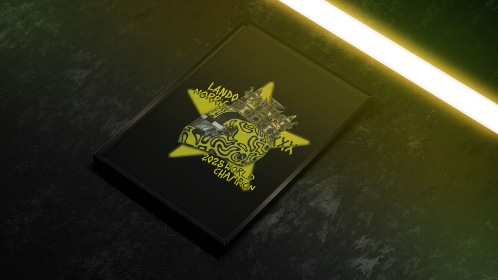
Commissioned by The Red Flags Podcast, this design celebrates Lando Norris’ 2025 World Championship with a visual style inspired directly by his bold, high-energy brand. The crowned helmet sits at the centre as a symbol of his long-awaited victory, supported by rough hand-written typography and gritty textures that capture both his playful personality and the […]
Miscellaneous Posters
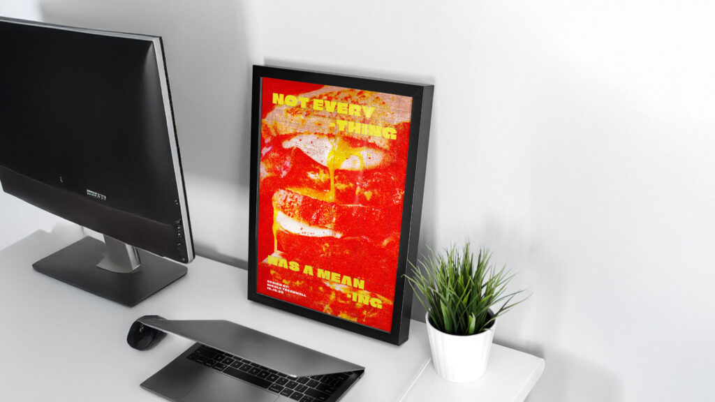
This ongoing project is a space to play, explore, and experiment. In between client work, I design posters to experiment with different illustration styles, layouts, and visual storytelling techniques. Each design is a study in composition, colour, and typography – a way to keep evolving creatively and refining my eye for detail.
Hit The Hay
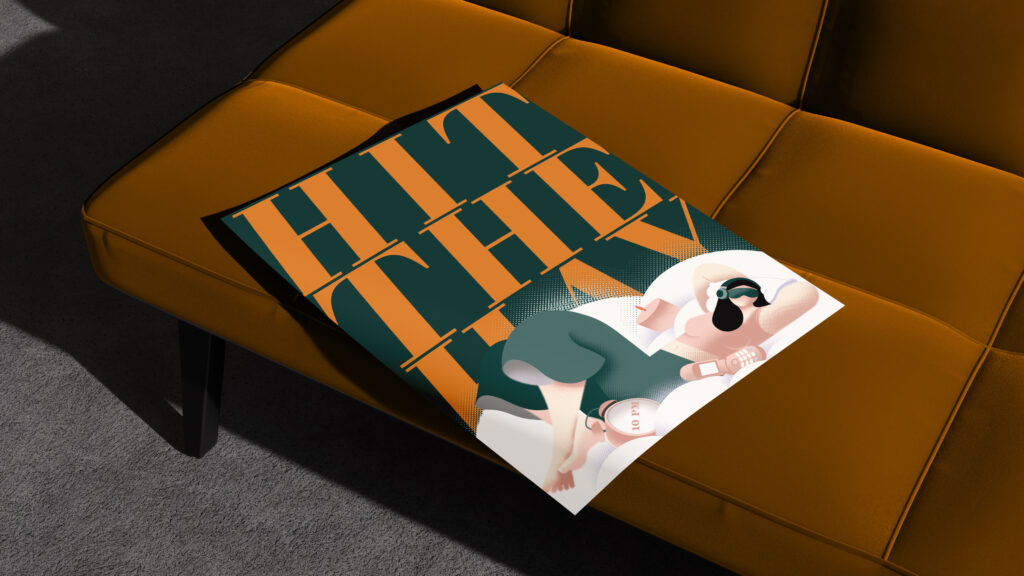
This project centred on creating versatile, human-focused illustrations for use across merch, posters, pamphlets, and informational brochures exploring the dangers of sleep deprivation. Using calming blues contrasted with energetic orange accents, the illustrations balance softness and urgency, capturing both the vulnerability and vitality of rest. The organic, fluid shapes add warmth and approachability, helping complex information feel human, relatable, and memorable.
Centre For Language Learning
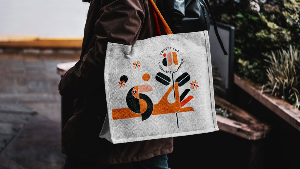
This project aimed to transform the Centre for Language Learning into a space that feels vibrant, engaging, and approachable. The goal was to make learning a new language exciting rather than intimidating through bold visuals, playful linguistic elements, and a lively colour palette. The result is a dynamic identity that celebrates creativity, curiosity, and connection – turning language learning into a joyful, inspiring experience.
Parapsych
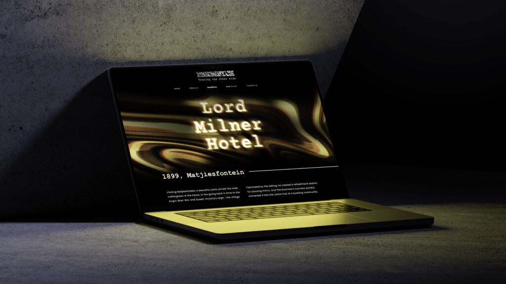
Created for the ISTD (International Society of Typographic Designers) 2023 Student Assessment Scheme, this project explores the concept of spaces – specifically haunted ones – and how their meaning evolves over time.
Parapsych is a fictitious tour company offering educational tours of South Africa’s haunted buildings. The goal was to reframe “haunted spaces” as historical and cultural experiences rather than purely paranormal or playful ones.
As a typographic design project, the work integrates type and meaning to create subtle tension: a palette inspired by the interiors and histories of each site, warped gradients reflecting heat signatures, and typography drawn from old newspapers and redacted files to evoke unease and curiosity.
Circuit of Spa-Francorchamps
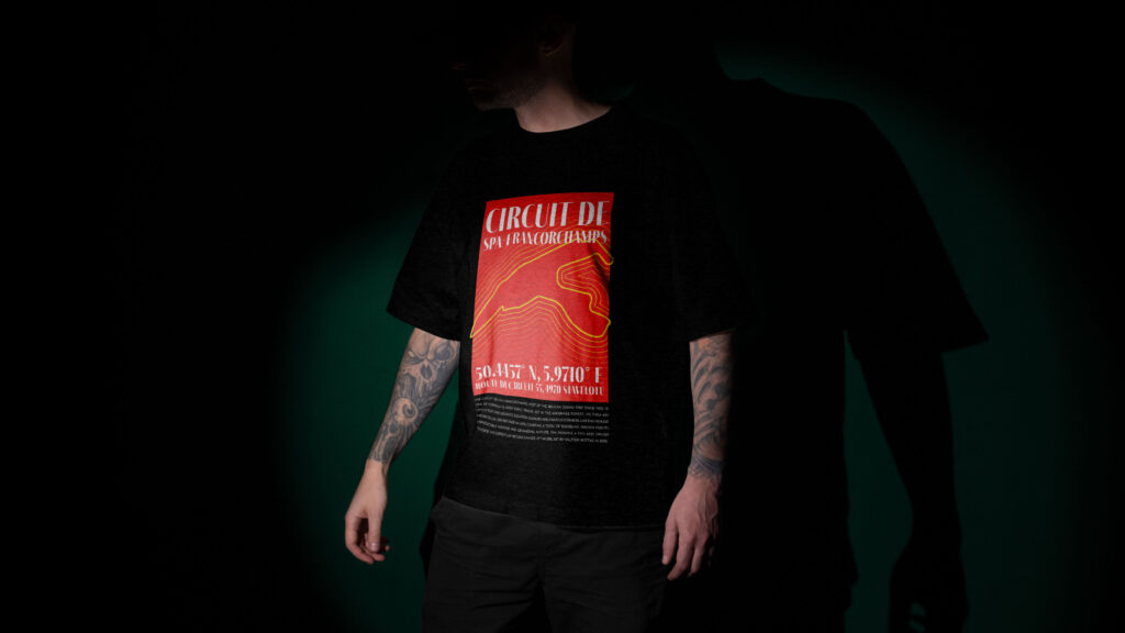
A self-initiated passion project combining my love for Formula 1 and design. Inspired by the iconic Circuit of Spa-Francorchamps’ history and heritage, I created conceptual merch. The project sparked a collaboration with an The Red Flags Podcast, where I now design merchandise; merging storytelling, fandom, and design into pieces that celebrate the culture of motorsport.
Tread Well Studio
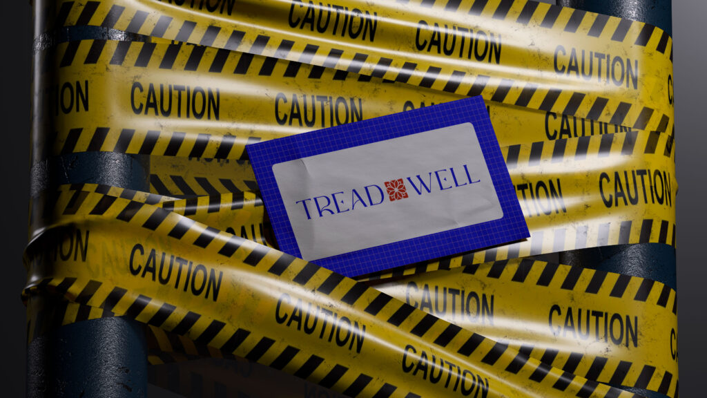
This project was the most personal brand I’ve ever built – my personal brand. An identity that balances strategy with personality, playfulness with professionalism. The creative direction leans into bold, playful visuals that reflect both curiosity and clarity. The result is a brand that feels authentic, flexible, and memorable. One that communicates trust while leaving room for experimentation.